
Case Study: UX/UI Design of a Travel Companion Super App
Matéo Palomino, Yi Heng Yan, published on Oct.30th
Introduction
People love travelling. Take a few days off work or school and go to some beautiful places, have fun, have a nice dinner, or see different views. Although do we always feel satisfied afterwards? Not always. PlanIt is an application that generates travel plans for users based on their needs. With this app, you can make your travel plans efficiently, choose many locations to visit and learn important information you may not have known.
Understand the problems
Having a good trip is not easy. There are too many uncertainties during the journey. You might have a bad experience on a trip because of many elements A few examples being, not planning, choosing terrible restaurants, the Airbnb or hotel is too expensive, the weather was not favorable, or everything isn't like what you expected...
Under Covid-19 circumstances, protocols differ between different countries, cities, even just different areas. Do you need a vaccine? Is there a curfew? Is a quarantine necessary? All these questions make travel harder.
Here the problems have been divided into two main fields. The first one is about making travel plans. There are too many elements present during the travel plan-making process: which transportation, Airbnb or hotel, which restaurant the user should choose. Which landmarks the user should visit and, of course, what activity the trip should include. The second field is about information. The different area has different policies. Unwanted consequences might happen if it is not well defined before the trip. Under the pandemic, the covid-19 regulations are variations among countries, provinces, cities, and areas. Where could the user get the information from? How do they ensure it is correct? …
Research and Analysis
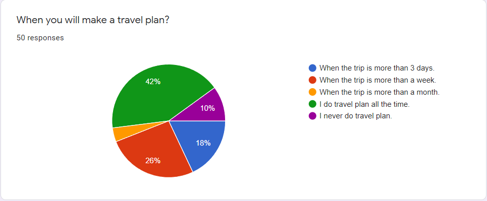
If we look at the data, 90% of people will make travel plans before they travel, and 42% of people say that they do travel plans all the time. Most people make a travel plan, and therefore the application is highly needed because the target population is enormous.
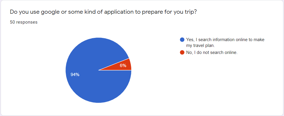
Furthermore, only 6% of people say they never use any application or website to search for a travel plan. It means that using an application or search online is the most efficient and most acceptable way of planning a trip.
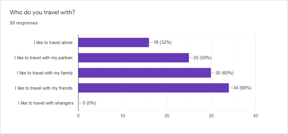
The following two questions ask about the type of companion the user will choose and the element they will consider when travelling. More than half of the population would like to travel with friends, families and partners. The data of this question gives us a better image of the user's needs based on their travel plans. Such as which kind of travel they would expect and which feature our application could include.

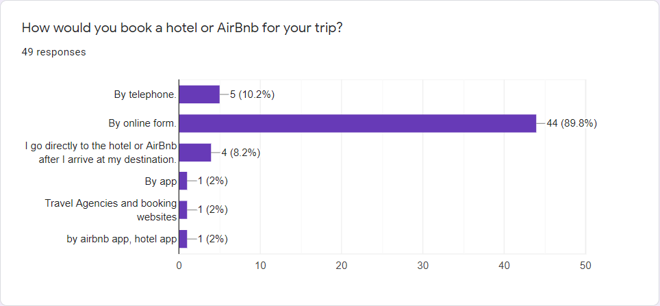
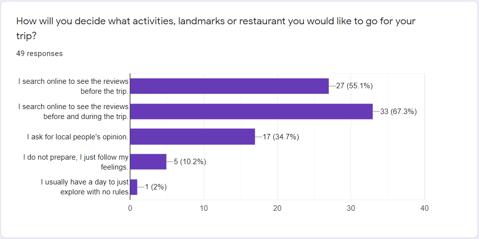
After we realize users generally care more about scheduling and budget. To better understand what kind of feature is required for the application and avoid unnecessary features, we further ask the user how they choose to make travel plans. Online form and search is the majority,
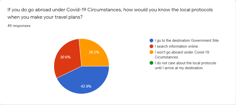
Since we want the application to connect to the world's current situation, we want to get information about people's opinions and views during the pandemic. Less than 1/3 of people say that they won't go abroad under Covid circumstances, which means the majority population will still travel. Still, they will do some research about the Covid-19 protocols.
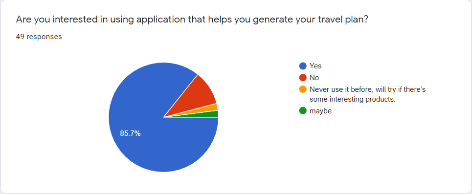
Then, we ask that if people are interested in travel applications, most answers are positive. 85.7% of people said yes, and two people answered maybe, 10.2% people say no. Means people are interested in using such kind of application. And since the majority answered positively. It is a good idea.
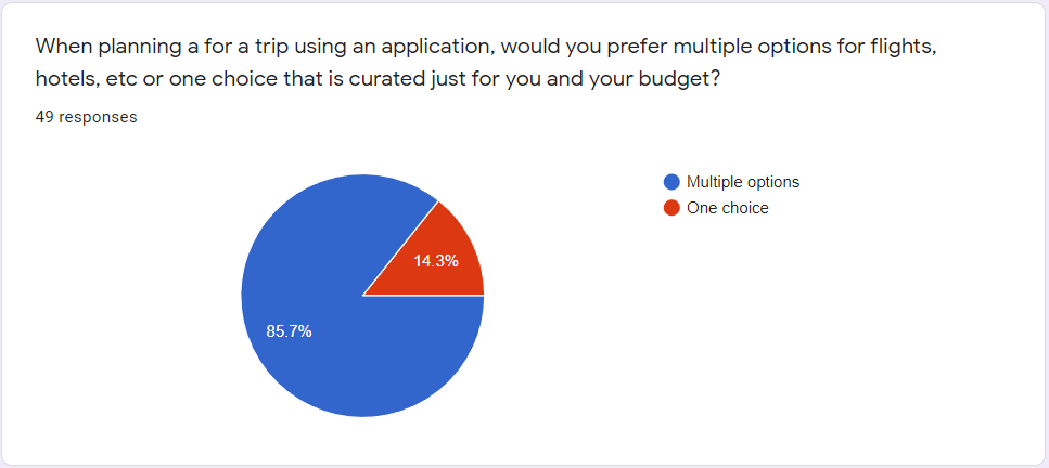
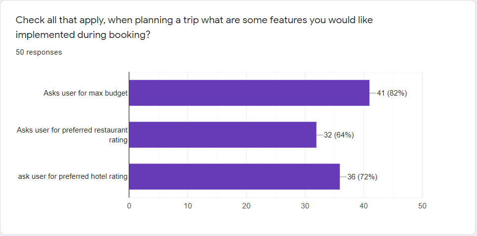
Lastly, we detail how they want the application should be developed and what features the user is expected to have or good to have. Multiple choices option for booking is the majority. And people would like to have a filter that they can apply to search based on different requirements.
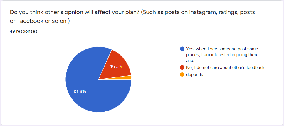
Also, the data shows that people are interested in others' opinions. Therefore, it is a good idea that users can see others' posts about their travel in the app and follow their travel plan template.
User Personas
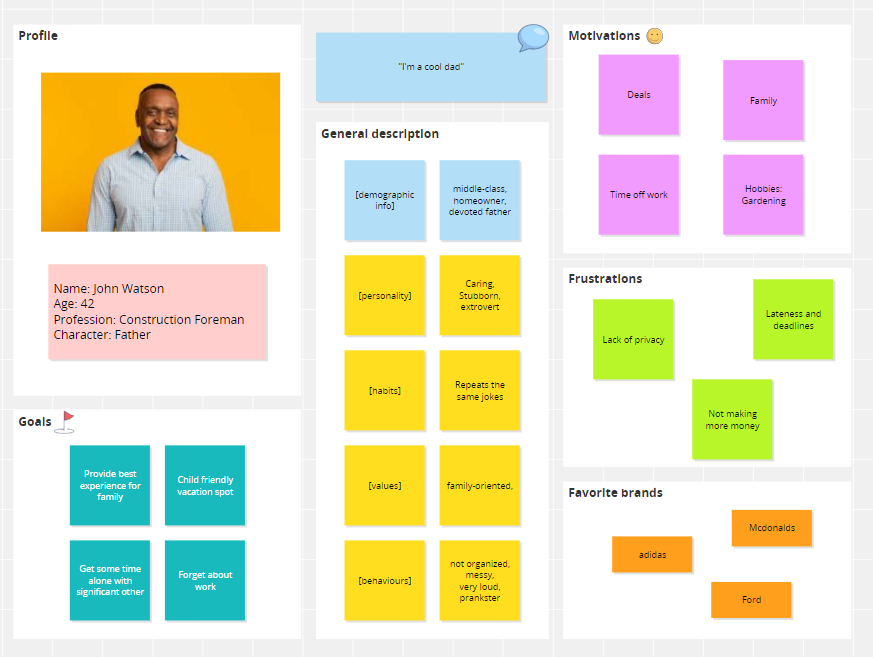
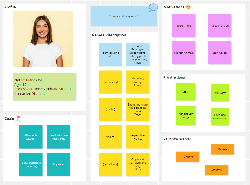
The research shows there are various needs by different people. The data from the survey helped us create two user personas depending on the age and their needs and motivation. The personas help us understand the user experience and user expectations.
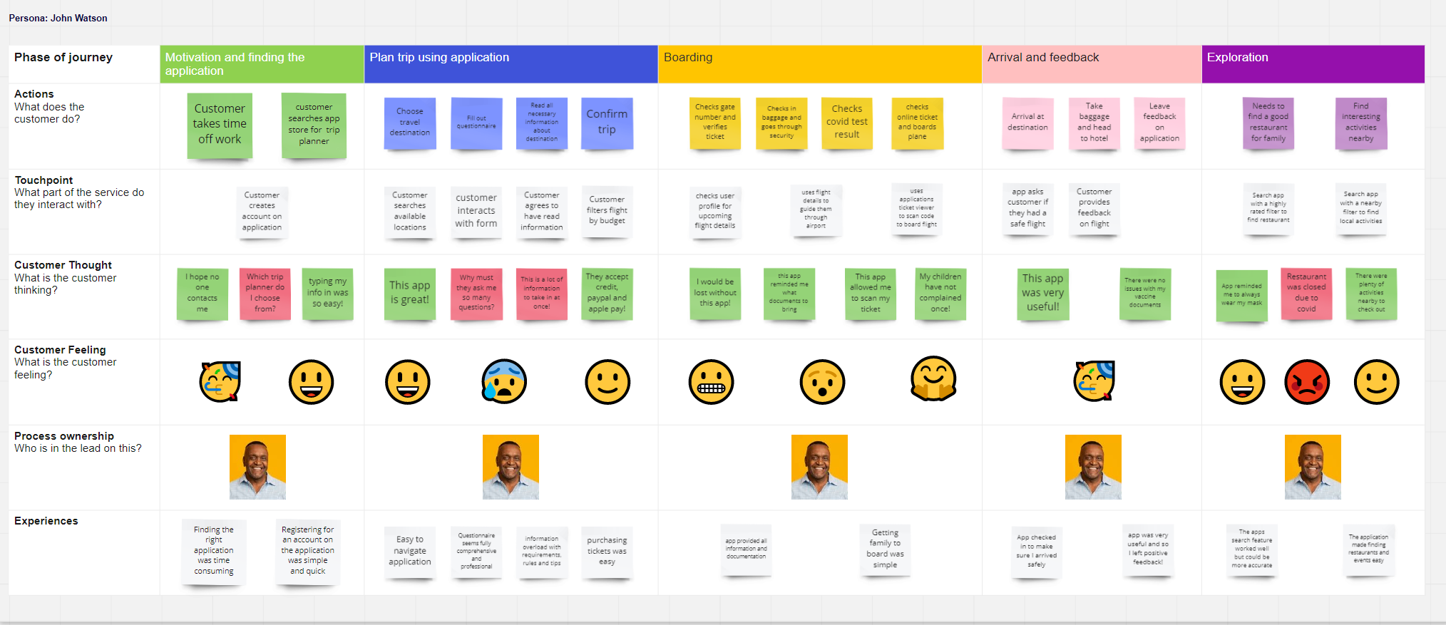
The first persona is John Watson. He represents the middle-aged population which mainly has their needs based on family.
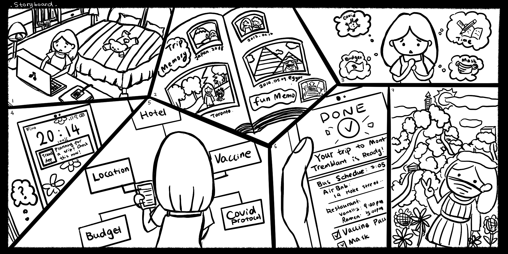
The second persona is Mandy White. She represents the teenager population which mainly has their needs on hobbies.
User Journey
We created a high-level user journey of user John Watson. It shows his journey using the application to plan a trip with his family going abroad.The journey map gave us a more evident hint on how the user expects the product and how they interact with our product.
Story Board
We created a storyboard, which is a very inexpensive but efficient way of presenting the user experience of Mandy White. As a student, she has many elements to consider when planning a trip. With the storyboard, we can determine which needs could be fulfilled.
User Flow
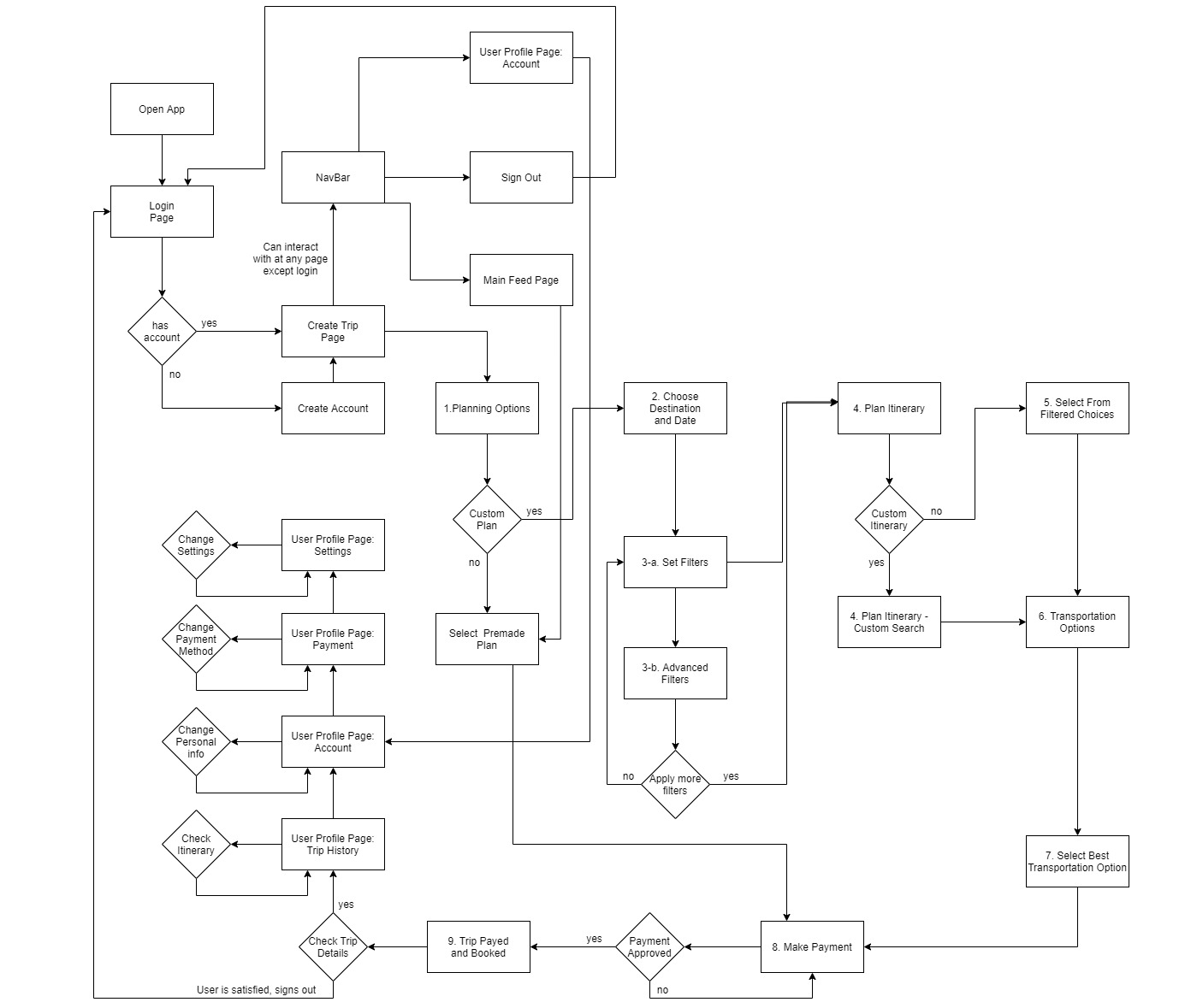
After researching and analysing the user experiences and expectations, we have brainstormed ideas and converted the ideas into a user flow diagram to better see how the application is going to work.
Sketch
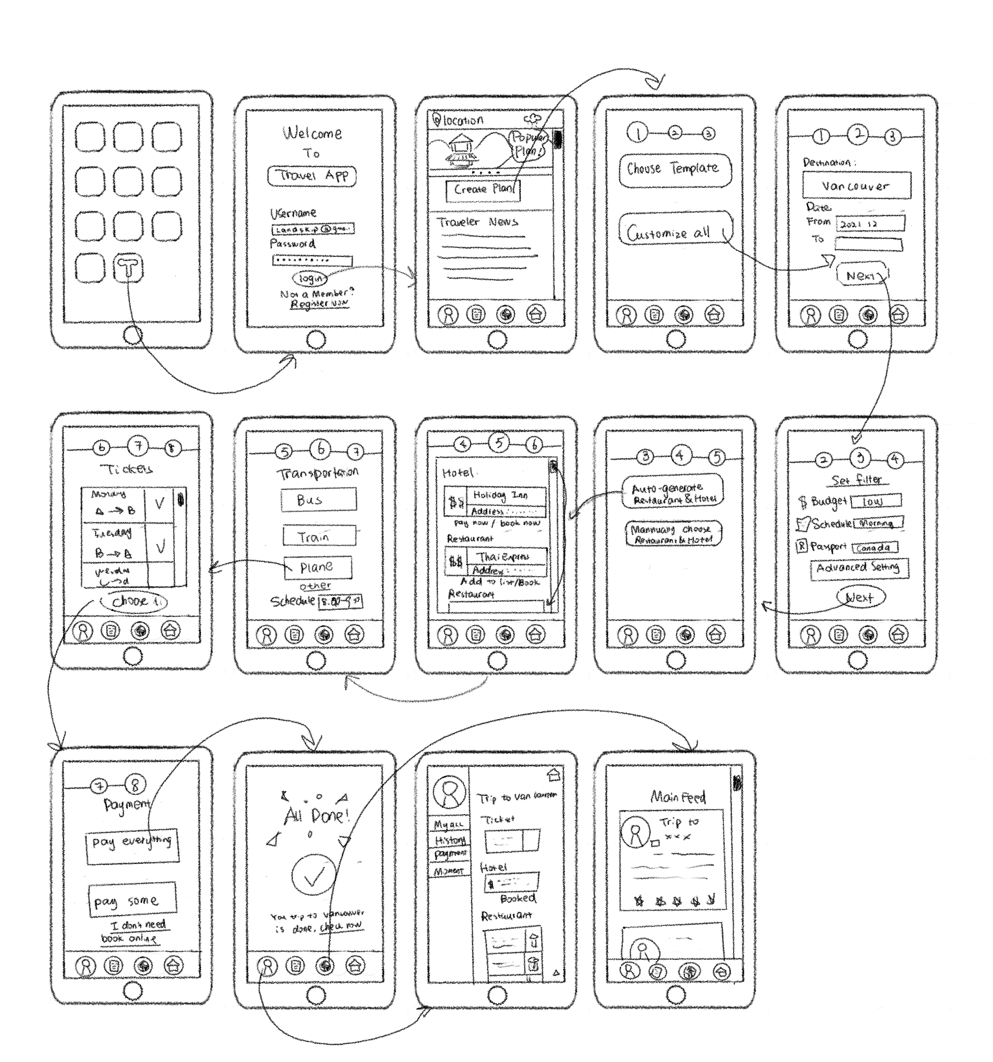
For the general idea of the design of our application, we use sketches. The sketches are the draft for the final design. It shows how the pages are connected, which element should be placed on which page. The sketches give a base idea of the final design.
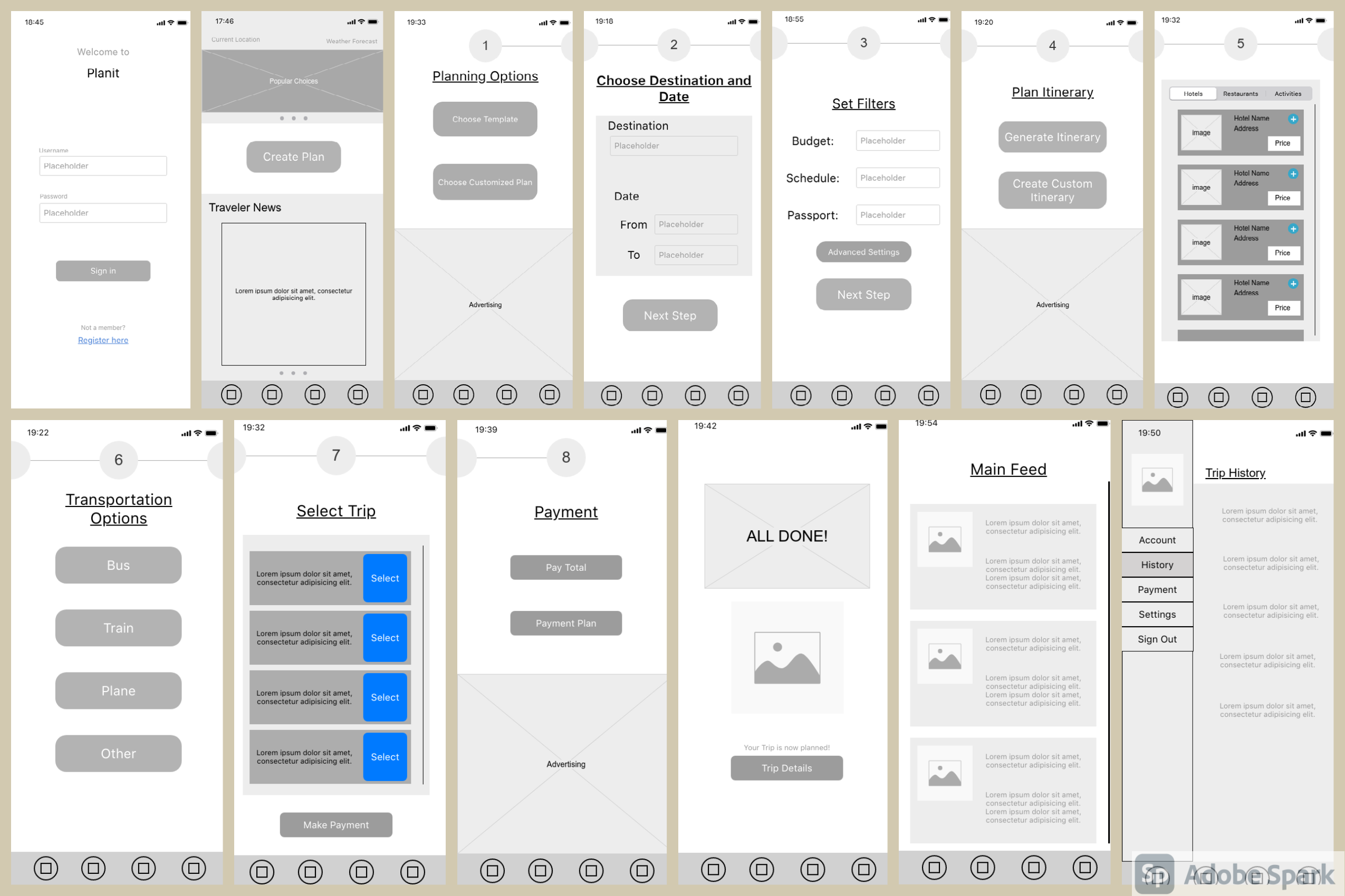
Wireframe
We have further created a wireframe based on the sketches. The wireframe gives a more precise presentation of how the final product should be functional. Instead of doing a functional prototype, the wireframe is more efficient and low-cost in achieving the goal.
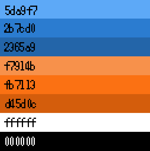
Color Palette
The colour palette we decided to choose was shades of blue and Orange. These compatible colours are pleasant to the eye, but they will also represent how this application will be highly compatible with the needs of the user. Blue being the primary colour of our application, will calm the user and show them how trustworthy and secure the application is. Shades of blue will be present in the header and navigation bar to enforcing a safe and calm environment. The secondary colour being Orange will be present when the user needs to interact with the application. These interactions will come in the form of buttons, notifications and more. We picked Orange because it is a happy colour that is friendly and relays a notion of affordability.
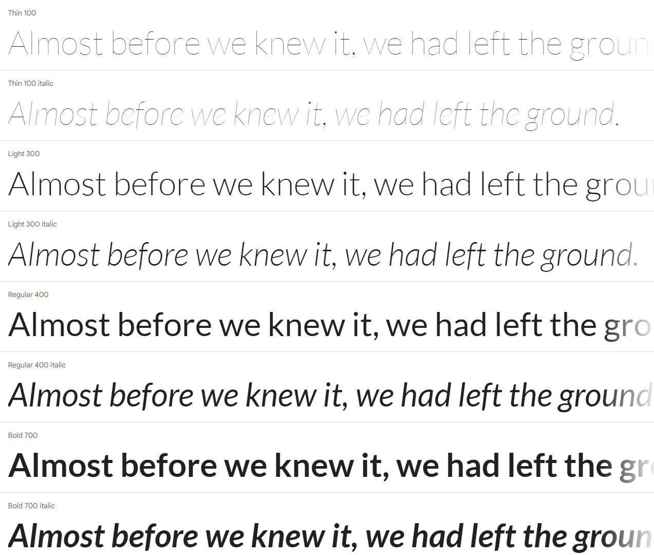
Typography - Lato:
This font is lovely for two significant reasons, it is a sans-serif font, and the lettering is bold. Sans-serif font has been easier to read when used on applications on devices such as laptops and cellular phones. Lastly, the bold lettering allows visually impaired people to have an easier time making out what the letters are.
Icons: Font awesome
We used font awesome as our icons library. The website has various icons from designers for designers. And it is open source. It allows us to improve the interface quality by adding meaningful icons.
![]()
Mocks Up
Furthermore, we created the mock-ups applying our desired colours, typography and icons. As stated in their respective sections, the typography 'Lato' is a sans serif lettering that is easy to read when the font is small, perfect for an application. The icons used were those found on the software used to create the prototypes called 'Font Awesome'; these icons are simplistic and appealing to the eye. Finally, the primary colours of Planit are blue and orange, which, as mentioned earlier, are complementary colours that truly represent the spirit of this application.

Final Design and Prototype
Based on previous research and analysis, and follow the user design process. We created a prototype of creating a customized travel plan.
Conclusion
In conclusion, planning a trip is always a complicated process. However, travel is very important to human beings. The problem arises such as difficulty to organize everything related to the trip such as budget control, booking hotel or AirBnb, booking a restaurant, visiting which landmark and so on. Also, during the pandemic, the protocol and policy vary on the area. The user might need to collect a lot of information and verify it to prepare for a trip.
By using the double-diamond design process, we discover and define the problem. We use user personas, user flow diagrams, journey maps, storyboards, sketches, wireframes and so on to design the application.
The application allows users to choose the template plan depending on their destination or create a plan based on their needs. The system has to book transportation tickets and booking restaurants, hotels and Airbnb, and such services. It can also show the information that the user needs to know, such as local protocol. Therefore, the user can organize their trip very quickly with the app.